


CambriaUSA.com Website Redesign
Cambria is an industry leader in quartz surfaces, renowned for innovative designs, exceptional quality, and superior service. Proudly family-owned and American-made, the brand is committed to excellence in every aspect of its business.
In 2023, Cambria invested in a new website to better reflect these values and expand its reach through enhanced digital experiences. Working alongside a talented team of researchers, developers, and designers, the company transitioned CambriaUSA.com to the Adobe Experience Manager (AEM) platform over nine months. The project followed an extensive, multi-phase research and implementation process to deliver a digital experience aligned with the brand’s commitment to quality.
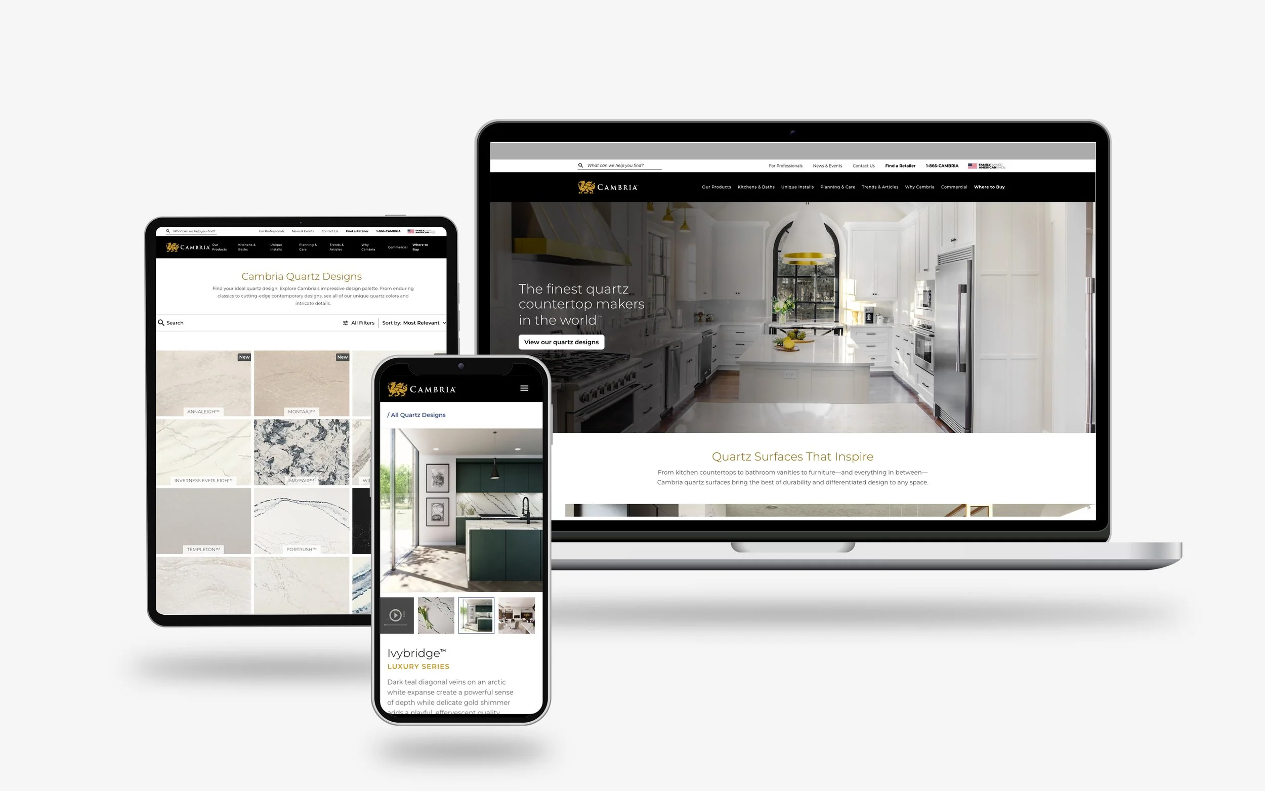
Background
Project: Responsive Website Replatform Migration
Role: Digital/System Designer
Timeline: 9 Months
Team: Cambria + Slalom
Tools: Figma, FigJam, Adobe Experience Manager (AEM)
Goals
Migrate Cambria’s primary website from an outdated Wordpress template to a customized Adobe Experience Manager platform.
Improve experience for sales representatives in the field who primarily use mobile devices.
Create an inspirational experience where visitors can see captivating visuals of every Cambria design.
Include tools and resources for every segment of Cambria’s b2b/b2c audiences
Outcome
Overall traffic for websites visits immediately improved following the initial implementation.
Field users respond positively to the optimized flow.
SEO improves overall reach.
New global search is a company first, allowing all web content to be searched and optimized more easily.
Full Project Case Study
Homepage Layout, Navigation, and Footer Considersations
When landing on Cambria’s original website, the navigation was often overlooked due to the content being broken up into top-aligned categories with the primary brand logo placed in the center of the screen. The website was not optimized for mobile use which was often cited by sales representatives as a frustrating experience because they relied on the site to reference information while in the field. Interactions were dated and input states such as hovers/rollovers to offer visual feedback on the buttons were lacking.
While the visuals of the products shown were immersive and inspirational on the original layout, the height of the hero banner video made it so important details were not visible within the upper fold of the desktop experience. When approaching the redesign, there was a desire for the imagery to welcome users into the experience and provide a wow factor while making it clear that content blocks were clickable in order to promote site exploration.
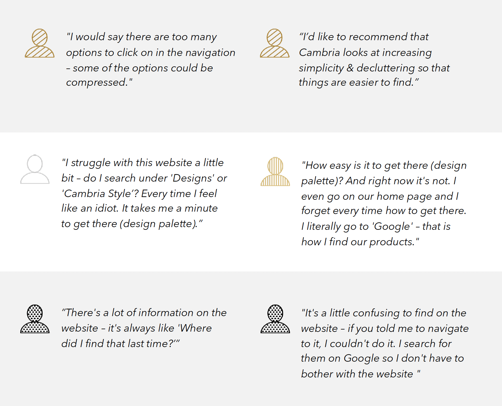
Graphic courtesy Slalom user interviews research report.
The site navigation was strategically structured through extensive research to create an intuitive, user-friendly experience. A multi-tier layout with left-aligned navigation prioritized familiar UX patterns and consistency. An auxiliary navigation was introduced above the primary categories to house contact information, audience-specific resources, and sample ordering, allowing the main navigation to focus on residential visitors seeking information and inspiration for home updates.
Interactive mega menus were designed to organize content into digestible categories, with featured imagery adding visual interest and providing opportunities to highlight content beyond the dropdown links. On mobile, the navigation transitions to a full-screen menu accessed through a hamburger icon, with the first category expanded by default for easy access to key content.
Cambria’s footer underwent significant restructuring to improve accessibility, content discoverability, and responsiveness across screen sizes. The original design offered limited responsive breakpoints, hiding much of the footer content on tablet and mobile devices and leaving only the contact phone number and “Find a Dealer” action accessible.
The redesigned footer introduced a more comprehensive selection of frequently searched topics and key navigation links, creating additional pathways to important site content. An email signup form, social media icons, and official app store badges were also incorporated to expand engagement opportunities. On mobile, content groups collapse into expandable sections, mirroring the primary navigation’s interaction pattern for a consistent and streamlined user experience.
Design System: Colors, Typography, Button Styles
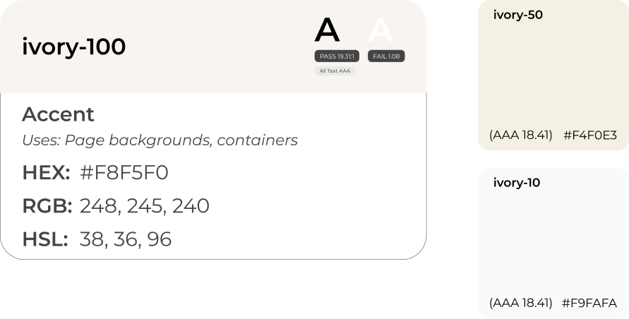
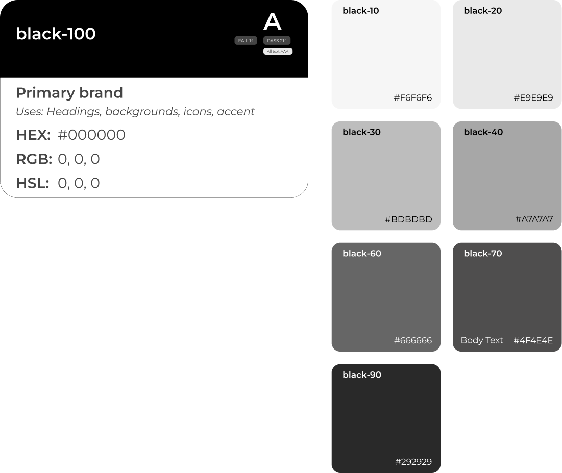
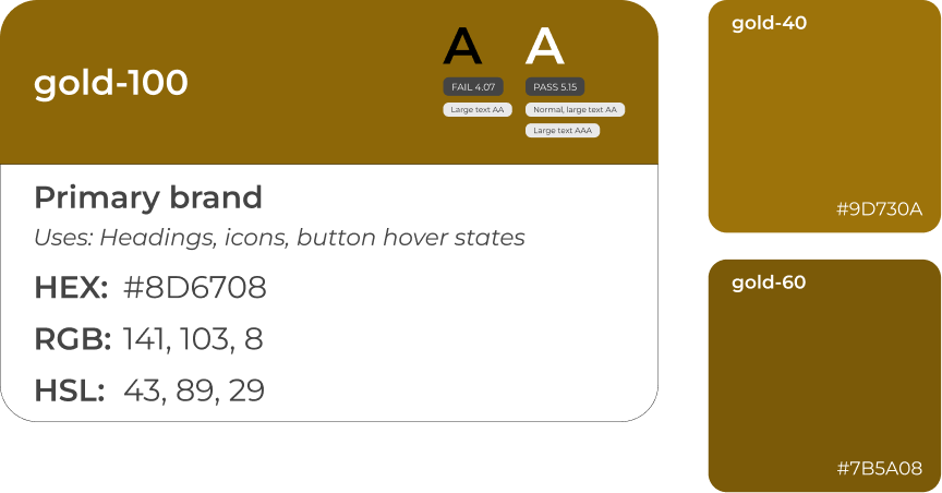
As a premium luxury brand, Cambria required a digital color palette that upheld its refined identity while meeting accessibility standards. The signature gold and black were adapted for digital use, with the gold adjusted to achieve adequate text contrast on screens. A separate digital gold was established alongside guidelines for its use to preserve its impact without overwhelming the interface. Black served as the primary supporting color, reinforcing the brand’s sophisticated aesthetic, while a light ivory was introduced to add depth and create visual separation between background panels.
To improve readability across content-heavy pages, body text was assigned a softer tint of black rather than pure black. This subtle adjustment helped create a more comfortable reading experience for longer passages, such as blog articles, without compromising legibility. The pure black was reserved for use in heading text which is bold, yet classic in style.
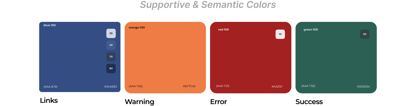
Supporting colors were governed by clear usage guidelines, prioritizing semantic functionality over visual prominence. A deep blue was introduced for tertiary text links, complementing the core palette while providing a familiar visual cue for clickable elements. This offered a more intuitive alternative to the default bright blue commonly associated with hyperlinks. Additional semantic colors were defined for warning, error, and success states across forms and text inputs. A dedicated magenta was also introduced to help internal marketing teams identify new content and track changes awaiting approval.
Montserrat was selected as the primary typeface for its clean, modern aesthetic and legibility across digital experiences. Lightweight font styles were incorporated into headings to reinforce Cambria’s premium positioning through a refined, minimalist visual language without sacrificing readability. A consistent typographic hierarchy was established to support accessibility and content clarity, with all-caps styling reserved exclusively for the homepage hero banner, title case applied to supporting headings, and sentence case used for H4–H5 titles.
To introduce visual contrast and editorial sophistication, Inria Serif was designated exclusively for pull quotes. Its expressive serif forms complement Montserrat’s geometric sans-serif style, creating moments of visual distinction while maintaining a cohesive typography system throughout the website.
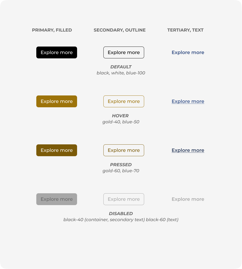
The button system was designed to balance Cambria’s premium aesthetic with clear visual hierarchy and intuitive interactions. Three styles were established to distinguish levels of emphasis: a solid black primary button for key actions, a black outlined secondary button for supporting actions, and a blue text-based tertiary button for lower-priority interactions. The signature gold was reserved for hover states, preserving its impact as a subtle brand accent while avoiding contrast issues that could compromise readability.
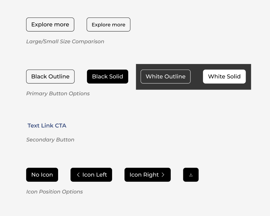
Two button sizes were developed to accommodate varying layouts and screen sizes across desktop and mobile experiences. Icons follow the Google Material Symbols system, using a lightweight 300 weight with sharp corners to complement the site's minimalist visual language. The right-pointing chevron (>) serves as the primary directional indicator and can be positioned before or after button text, omitted entirely, or displayed independently when space is limited, as demonstrated by the download button. These flexible configurations maintain consistency while accommodating a range of functional needs.
Specialized Digital Experiences
Several key pages and features across the CambriaUSA.com platform required specialized design considerations to support the diverse needs of prospective customers, website visitors, and internal audiences. With Cambria’s extensive quartz design collection serving as a primary driver of site traffic, we developed interactive product displays that showcased slabs in spectral order and revealed real-world installation imagery on hover, helping visitors connect product designs with their potential applications.
Beyond product discovery, the inspiration gallery, interior product detail pages, sample ordering experience, and Cambria Style digital magazine were thoughtfully designed to support the customer journey. From exploring aspirational interiors to discovering product specifications, and reading authentic customer reviews, each experience was crafted to connect inspiration with informed research decisions while reinforcing Cambria’s premium brand identity.
Video demonstrating the inspiration gallery experience.
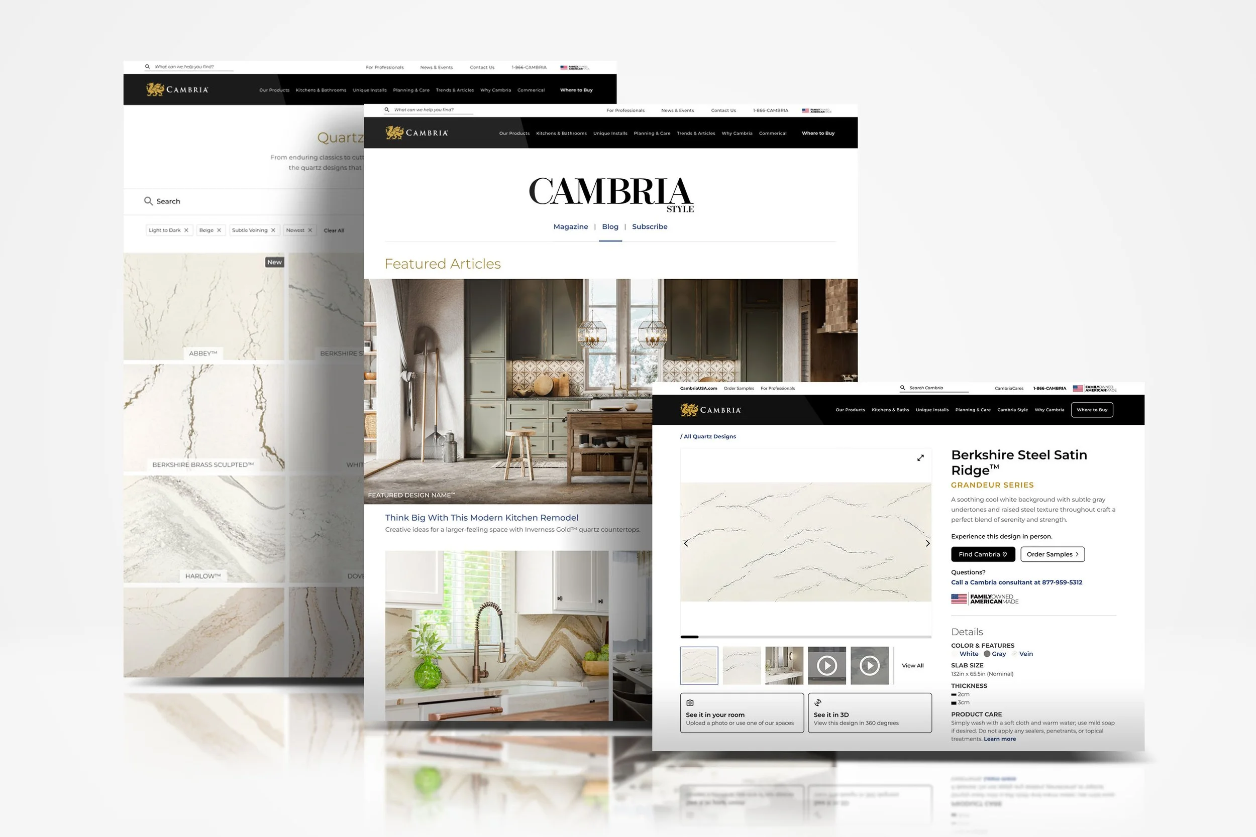
Desktop page samples showcasing the design palette, Cambria Style editorial landing page, and updated product detail pages
Significant testing was devoted to the functionality of the inspiration gallery. The desire was to allow users ways to feel immersed within beautiful interior spaces and immediately understand what product applications were being demonstrated, as well as supply the information at-a-glance for the Cambria design. This was achieved by showing the interior space photography within a masonry grid style that spans the full-width of the screen.
As the user explores the imagery, a design name label appears on rollover. Interacting within the inspiration gallery supplies a simple informational modal that shows the quartz design name, and provides three CTAs for actions:
Link to product design detail page
See an example in your space using 3D preview
Offer sample ordering
The filter interactions were researched at length to ensure a clear, easy-to-use experience. Due to a presence of retail visitors and commercial designers, a toggle switch was added to easily switch between seeing residential homes and commercial projects. The individual dropdowns show oversized color swatches to sort by hue in addition to allowing the user to include more refined selections via checkboxes for room type and product application.
Desktop page samples showcasing the design palette, Cambria Style editorial landing page, and updated product detail pages